
The Branding Guide for SMBs Part 1: Logos, Visual Brand and DBAs


Introduction to Brand
Your brand is more than just a logo - lets get that out there before we dive into this subject. Brand as a whole is your business's reputation, personality, perceived quality - It’s what people think and say about you when you’re not in the room. The Brand is influenced by things you can directly control; Like messaging, packaging, quality, and design etc. and things that are out of your control such as customer experience, reviews, and the reputation of the industry you operate in (for example the betting industry has a negative perception as a whole).
There are 2 key parts to "Brand". There is "Brand Strategy" - which focuses on important things like Brand Story, Brand Positioning, Targeting and Messaging. And then there is the "Visual Brand" (Logo, Packaging, Design and so on) Which is what we focus on in this guide; What makes a good logo? What is the purpose of the visual brand? Are rebrands worth it? What are distinctive brand assets?
Let’s simplify the Visual Brand first...
Let's think of a person in your office, or maybe a client / supplier..Do they have an interesting name or surname? Are they tall? or have curly hair? maybe a nickname?
That's all part of their 'visual' brand. It's how we recognise them, describe them and identify them.
Your logo is a brand identifier. One of the first things customers see and how they remember or think of you in the future.
As visual symbols, logos are more recognisable and memorable than names alone. Helping your customers in recalling your brand more effectively.
A bit like a face to go with the name?
Making it much easier to remember brands & people. The logo is often combined with other types of identifiers or distinctive brand assets also known as 'Brand Codes' to create a stronger brand identity.

You don’t need to ‘see’ the McDonald’s logo to recall the brand. Half an arch, the distinctive red & yellow, the jingle or the tag line (I'm Lovin it) are each enough on their own and potent when combined together.
People use brand names & logos as ‘heuristics’, or a mental shortcut to associate the offerings of the brand with the name itself. If we're being objective, McDonalds is a terrible name for a fast food place, it sounds great for a hardware store..but we never think of that part, the logo acts as a trigger for (non visual elements)
When creating an "Effective" logo, being unique and distinctive is one of the most important factors. The whole point of an identifier is that it reminds people of your brand and sets your brand apart from competitors. It doesn't have to look 'pretty' or technical or show what your product / service (not for your turnover & size). It's also important to realise that no one really cares about the design, name, tag lines and other things you'll hear agencies throw around.
A good design helps, yes. The purpose of the design (and commercial value) is to be memorable, as a unique identifier that is easily recalled at the time of purchase.
So what makes an effective logo for an SME?
A good logo isn't good enough, it has to be EFFECTIVE. As a managed marketing provider that specialises in medium sized enterprises (ME’s) and smaller brands (SME’s) we know what works.
The logo has to make your brand easy to spot, recognise and remember. This is more important than ever, in the current environment where users are consuming terabytes of content each day.
The best logo's for SMEs must have these 3 things to be effective in the current climate;
Be Bold and Unique
Its critical to have a logo that isn’t confused with other businesses, especially in the same industry.
Unfortunately, the starting point for most brand agencies or freelancers is to look at the industry, at competitors brand & messaging and take ‘inspiration’. Which is the worst possible way to start the branding process.
Because If you’re driving past a field with cows, you’ll definitely remember the purple one?
A unique design stands out and creates better memory structures. While your typical designs, colours and shapes are lost in the sea of sameness. If you’re serious about building a brand, go bold.
it's important to keep in mind, as an SME you don’t have the marketing spend of larger brands. A unqiue brand (within your sector) does a good percentage of the work for you. Your limited spend goes much further and has more impact.
Wordmarks & Typography
The name IS the logo, which sounds boring, so let’s say it in French - Le nom est le logo.
Having the business name as part of the logo is a great way to improve brand recognition..typically this style of branding is called a Wordmark (Also called a Typographic logo or Letter mark). Don't fall into the agency trap of fancy icons and graphics, leave that to the big brands with millions to spend reinforcing those icons.
A text based stylised logo that combines the name into a symbol is a win win, it builds greater memory structures and creates instant recognition. There are some limitations with this style, depending on the business name and length this execution may not be possible, but that's a design challenge for the agency.
We advise clients wanting to change or launch new brands to consider the wordmark and include it as an option on all projects.
The icon (other than very selective scenarios) creates confusion and is less effective for smaller brands. The brain has to perform a two-step lookup ("I see a swoosh -> That means Nike"), whereas a Wordmark executes a one-step lookup ("I see FedEx -> it's FedEx").
The swoosh isn't a comparable example because its been reinforced over the years.
Remember your icon is never going to be as well known as the iconic Swoosh or Col Sanders - Although it can and has been done, but in our experience, owners, leaders and marketers at UK SMEs typically never have the spend or consistency to successfully implement this in the real world.
For unknown or Small / Mid sized brands a wordmark ensures better discovery that can continue across multiple touch points. (I see unkown brand bigmonsterpotato) on the back of a van (I can search for bigmonsterpotato).
If you have the right social handles, or rank for the term across search channels (Google or AI). Discovery can carry on across all of these channels. (especially with social channels also becoming more search focused).
Good Design, Scalability & Compatibility
Your logo NEEDS to be plastered everywhere for it to be effective - That’s the whole point. So it needs to be compatible, legible in different sizes, over a range of backgrounds and across different platforms.
This is where the good design skills and principles come into play. A solid brand designer or agency earns the stripes.
Colour: Colours that are unique and compatible.
Layout: Mathematical alignment, Visual alignment and Spacing.
Scalability: Legibility at different sizes.
Monochrome viability: Works in black and white.
Distinctiveness: A design that stands out within the category.
Businesses typically over analyse the design part from a personal point of view. How it looks? It's not cool or cute enough?
Why have we used Orange or Pink?
All of this comes at the bottom of the list when it comes to brand & logos.
Personal preference has no place in science. While a good brand and marketing agency will handle most of the technicalities around compatibility, the final call will always be with the senior leaders, marketers or business owners. It's important to treat this as a scientific process. Context is extremely important. Where is the logo going? packaging types, product size, and common areas where the logo will be going should all be taken into account. How it looks vs other brands and logos (put them side by side). Will it stand out on the supermarket shelf? Is it a service based business with vans going up and down the country? Is it a physical or digital product? and can we get good Distinctive Brand Assets around this?
What are Distinctive Brand Assets (DBAs) and Do they work?
Distinctive Brand Assets are non-brand name elements, such as colours, logos or characters that uniquely signal the brand. DBAs, when used with the brand name, can increase the chance that consumers notice the brand in a highly cluttered environment.
A distinctive brand asset has two characteristics—it must be ‘unique’ in that it only evokes the one brand, and it must be ‘famous’, meaning that everyone who sees it, thinks only of that brand. Out of these two, uniqueness is most important.
Lets move back to that person in your office...
Was there something unique about them?
A distinct fashion sense? bright shirts? a favourite phrase they use?
Would they be more memorable if they always wore a bright green shirt? What if they drove a bright green car as well?

DBA’s are important for all brands and should be considered by SMEs. There is a wide range of assets from Product design, Colours, Packaging and more.
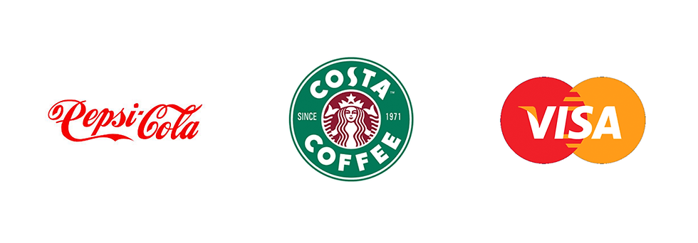
Research by the Ehrenberg-Bass Institute says consumers rely on quick mental shortcuts (colours, shapes, and familiar typography) rather than reading actual text.
Can smaller brands implement DBA's? Doesn't this require massive spend?
Well you're not going to get McDonalds famous on a SME budget, but you're not competing with them either. For SMBs using distinctive brand assets is a way to stand out within your own industry by improving brand recognition.
In fact DBA's can help SMBs save money on their marketing in the long run. In fact testing distinctive assets outside category context produces misleading results.
OutpostX Marketing helped a manufacturing client create a DBA by owning the colour 'safety yellow' within their industry. We introduced this brand colour to every single product on sale. (along with brand / material / uniforms) Our research showed that the colour wasn't used anywhere else in the industry, with plain metal finishes or different shades of blue being most common. The bright yellow created brand recall before someone saw the logo, and anytime someone from the industry saw a yellow height safety system - it could only really be
one brand.

What are the different types of DBAs?
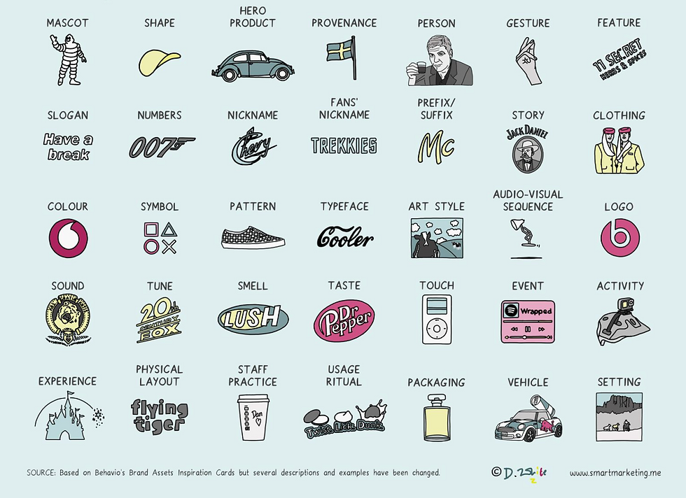
There are more than 30 different types of Distinctive Brand Assets that brands can 'own'. Ranging from mascots (Col Sanders), symbols (Swoosh), patterns (Burberry), audio (Netflix) and more.
But there is a science behind implementing Distinctive Brand Assets.
Simply creating 30 assets doesn't work. The assets that work vary across different sectors, just because one brand in your industry has had success with a particular asset doesn't mean you will too. You can't just pick a random colour or icon. The execution requires a measured, consistent and planned approach. Think of all the different assets you recognise, from 007 number to the golden arches - it took years of consistency to reach this level.
The goal with visual brand is not to have 15 different brand assets - we are already quite good at creating that, they're part of most brand decks & presentations.
The challenge is making sure it helps improve brand recognition and recall. Typically DBAs have these 5 factors.
Consistency: Assets don't achieve distinctiveness quickly or if they are changed every couple of years. They require consistency and sustained investment.
Simplicity: Each asset is simple enough to recognize in peripheral vision or memory, DBAs can't be complex.
Category unusualness: Each DBA typically goes against category conventions when introduced (purple for chocolate, triangular packaging for confectionery)
Multi-sensory where possible: The strongest portfolios combine visual and auditory assets (although its harder for SMEs to implement, it is an option in certain industries)
Legal protection attempts: Most brands have attempted to trademark their distinctive assets. (again this comes much much later for SMEs)
Context and category are important in determining distinctiveness as well.
If we look at Tiffany Blue. In the luxury jewellery category, it achieves exceptional Fame and Uniqueness scores. But test that same shade in the household cleaning category, and it becomes generic.
You could find out more about calculating fame and uniqueness - or leave it for a competent marketing provider to look after it for you
But now that you know all of this... Is it time for the 'R' word? To rebrand or not to rebrand
Answer is, It depends. Around 60%-70% of rebrands (major rebrands) are a waste of time and money - There are certain factor that make rebrands worth the investment. If your existing brand is largely forgettable, as a business you don’t have a lot of history and your brand isn’t very well known, combine that with a visual brand that looks tired, drab and isn’t ‘effective’ (according to the criteria above) then yes you could consider a rebrand.
But if you have some history, a good reputation, and are fairly well known in the industry then you should be more careful.
Rebrands should usually have solid strategic and technical reasoning behind it. Technical issues include legibility at lower sizes, physical production issues, accessibility issues and quality issues.
Strategic reasons can include differentiation, modernisation, mergers, changes to target audience and/or services.
Rebranding, simply because you’re tired of it is a No No. You see your logo everyday, of course you’ll be tired of it - but your customers don’t. It takes years of consistency to build a visual brand that is recognised by customers.
Think of all the brand logos you recognise today (Starbucks, Google, McDonalds) they haven’t been changed (other than minor tweaks) in years! Which bring us to the next important element.
Type of Rebrands
Major Rebrand - (Often ‘Rebrand’ refers to a major rebrand)
Major changes to the brand, either moving to a completely different name, logo or modernising the existing logo to such an effect that it is no longer recognisable. Proceed with caution on this. The temptation is big with this one, a lot of it pushed by agencies who love a blank slate.
Any decision on a major rebrand should be preceded with strong research, reasoning and a solid strategy. OutpostX Marketing can help with all of those elements including executing a major rebrand, which requires greater planning around the delivery stage as well.
A major rebrand only makes sense in certain limited scenarios:
1) There is a major change to the services offered by the business. Strategic change in business and critically the target audience. This makes the rebrand a commercial requirement.
Perhaps you’re now selling luxury goods, or moved from hardware to software?
2) A merger which forces a change of name or combining of two or more businesses. Law firms are a good example, but happens in any merger where both brands have good value and reputation. Combining the names, triggers a rebrand that combines both brands values in an effective design.
3) Negative brand reputation of existing brand. The reputation of the current brand is so bad that it's not worth trying to salvage it, start fresh with a new name and brand. This usually requires a lot of changes at the product side (otherwise the rebrand fails) The logo highlights a fresh, new approach.
Overall, the complexities around Major Rebrands make up most of the % of rebrand failures. The failure isn’t just a waste of time and money, failed rebrands have real commercial impact, often even leads to decline in sales as seen with Tropicana and Bahlsen.
System1 Group (Behavioural Effectiveness Database): System1’s ad and brand testing data reveals that over 50% of major visual rebrands result in lower emotional response and fluency scores compared to the original assets. Their research shows that when brands replace familiar visual codes, short-term consumer recognition drops by an average of 30%, requiring massive ad spend just to return to baseline awareness.
Minor Rebrand (Also called a 'Brand Refresh')
Tweaking, modernising or updating the existing brand to meet certain strategic or technical requirements. Logo looks almost identical to the previous brand at first glance. Consumers barely notice the difference.
This is the tactic used by many large brands (Google, Microsoft, Starbucks, Honda) where the logo has changed but still keeps key features, colours and design elements.
The logo passes the squint test, where it looks almost the same when squinting.This is the safest and most successful option in terms of rebrands. If your logo isn’t ‘effective’ the option of a brand ‘refresh’ can achieve both strategic and technical objectives. Minor rebrands are more successful and help move the rebrand failure rate down from 70% to around 30%. What next?
Creating a brand that can represent your business long term, and having a short and simple brand guidelines document so your internal or external marketing team / marketing agency can consistently adhere to and ensure your brand gets maximum visibility.
Bottom line
Marketing your business, growing it on a smaller budget is extremely difficult. Reach is now limited across many channels and ads are really expensive for mid-sized brands. The rules of growth, and marketing science is 'free'. It tell us how to businesses grow, and SMEs should benefit from this to enable growth.
This guide is specifically designed for medium sized & smaller brands with a current or targeted turnover of £2 - £15 million pounds. Although key brand principles and marketing science don't vary much based on business size, the application and execution is different.
OutpostX Marketing is a specialist managed marketing provider for SMB’s in the UK in sectors such as Legal, SAAS, IT, Construction, Manufacturing and Consultancy businesses, specialising in B2B and big ticket items. For more advice or clarification on anything above, or to discuss how to improve your brand or implement DBAs get in touch